Category Archives: Tips and Tricks

Bezels bezels bezels

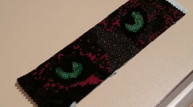
I am embarrassed to admit it, but Christmas Present A is still waiting to be mounted and sent. It’s finally recovered from its months of high tension on the loom. But I did so much loomwork right before Christmas that I’ve burned out on it a bit. It won’t last. There are stories that need pictures.

In the meantime, I have been playing with my favorite treasure hoard — vintage Swarovski heliotrope (undrilled) stones. So I took a few pictures this morning. The camera can’t do them justice. I have no idea what I’m going to do with them when I have enough of them done. I don’t even know what “enough” is at this point. They’re just awfully pretty and relatively quick gratification compared to weaving a 9×12″ beaded tapestry.

PeyoteBezelHoard

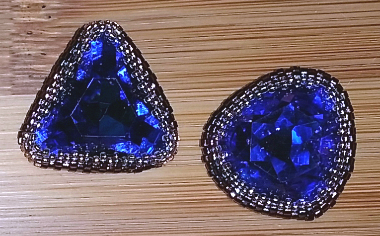
The trove, as of this morning. The three squares in the upper left corner are a 23mm 4675, an 18mm 4650, and (sort of down and between them) an 18mm 4470 which has rounded corners.  Here’s a closeup:

PeyoteBezelSquares
Clockwise from upper left: 23mm 4675, 18mm 4650, cushion cut 18mm 4470 with rounded corners.

In the upper right, two triangles: an 18mm 4727 and an 18mm 4723, with rounded tips.

PeyoteBezelTriangles
On the left, 18mm 4727 triangle with sharp corners. Right: 18mm 4723 “cushion cut” triangle which has rounder corners.

The lower half of the picture includes a 12mm 4866 stone (called a “rocket” because it looks a bit like the Apollo command capsule — if that’s before your time, please Google, the cold rain here in Austin has me feeling quite old and arthritic enough already); two vintage 14mm rivolis (1122); a 20x15mm 4140 oval; and 4 vintage 10mm 5100 beads.

Corners are notoriously tricky for peyote bezels, because peyote stitch gives a very close fitting frame for the stone, and corners require precise, fiddly decreases. I used Bead&Button’s Stones with Corners (Beading Basics) for these pieces. It’s brilliant. When you’re weaving a bezel for a circular or oval stone, you start with a row or three of peyote with cylinder beads, and then switch to 15/0s to capture the stone snugly. That’s how I’d always started out for stones with corners, as well.  Lesley Weiss’ genius idea was to include 15/0s in the initial rows, at the corners — you can decrease in smaller “steps,” which gives a much more elegant finish.

I also found Artbeads’ Handy Tip How to Make an Open Back Peyote Bezel helpful for round stones; as well as Laura McCabe’s book Creating Crystal Jewelry with Swarovski, which covers several different stone shapes (available for the Kindle, as well as in paperback format).

The Delica Brown Blues

Black animals are hard to photograph — they look like blobs of black in most light — and they’re just as hard to bead. Harder, in some ways, because a camera will record whatever color it sees.  Not necessarily the color that the human eye sees, and not necessarily a color for which there is a matching Delica.

I made several peyote weave pictures for Squib’s scrapbook (having not yet gotten into my loom groove). Most of the patterns featured black cats, but the most realistic “cat eyes” pattern I could find had a tabby with a white streak down the nose:

Hannah Rosner’s Cat Eyes Cuff Pattern

For my first take on the pattern, I lumped half of the original colors into a new “black” category (using Delica DB10, opaque black) and the others into the “brown” category, using DB1584 (opaque matte espresso bean).

(This approach failed, a lot. Even if the DB1584s had not been playing some evil beady Jekyll-Hyde game, the final bracelet looked blotchy rather than naturally striped. My second pass was more successful; see below.)

Delicas are the bead of choice for most weavers I know, because they are very consistent in color and size. Well, mostly consistent. A couple, maybe more, shades of Delica browns change color dramatically, depending on the light.

The following are not great photographs (I’m less than inspired to take great pictures of a collection of bad artistic decisions), but they show the effect of light on DB1584.

I work under a daylight lamp, which is fluorescent, and this is probably  why I didn’t know I had a problem until it was much too late.

This picture shows the bracelet under fluorescent light. It looks okay; there’s still more red in the image than is visible to the naked eye, but it’s still “brown.”

"opaque matte espresso bean" Delica in fluorescent light

Here’s what happens when you look at the bracelet under daylight, through a window:

DB1584 viewed with daylight through a windowAside from being ugly all on its own, the red shows how badly my “black or brown” choice to replace colors worked out. Ugh.

And this is what the bracelet looks like under the incandescent lights in the bathroom (the angle is weird because the lights are not usefully placed to photograph objects on the counter): DB1584 in incandescent lightYeah, it’s really bright. Really bright RED. Wow.

I don’t have a comprehensive list of the Delicas that display this change, but I’m starting to keep one. The only other problematic color I know about it DB1134 (opaque chocolate); one of my vendors shows the shift in their image of the bead.

Delica DB1134 Opaque Chocolate

There’s no fix except to avoid those colors. I am buying brown Delicas locally so I can be sure they don’t pull this nasty little stunt.

If you’ve had a similar experience with other Delica colors, or have other info on the topic, please leave a comment. I’ve poked around at Miyuki’s site but haven’t seen anything.


And for those who are interested, here’s the cuff woven with my second set of colors.

I used Hannah’s pattern because it was the most natural looking of the ones I could find.

Second time around, I assigned a different shade of dark grey to each of the original colors in Hannah’s pattern, with no brown at all. There aren’t many options for shades of black and grey in the Delica line — I tried to avoid anything with an AB or luster coating, but had to use several metallic shades to have enough colors at all.

My final’s not natural looking at all (unless you’ve galvanized your cat). But it is more realistically detailed and more interesting to look at than my first try.

Cat Eyes bracelet with no brown

Weaving a large bead tapestry in sections

[Or, “I can’t reliably & correctly load 180 beads/row on my needle!”]

The biggest issue standing in my way when it came to large bead tapestry was the number of beads per row. I’ve woven pieces as large as 110 beads across, and that experience told me that I needed a way to break things down if I wanted to do anything wider than that.

This question typically arises for beaders who have small looms and want to weave something larger than their loom will support. But it’s just as important for folks like me who don’t trust their ability to get the right beads in the right place every single row.

There are a lot of possible answers to this question:

The Bead Weaving Basics page at Mirrix Looms has a diagram that illustrates anchoring your current row of beads into the adjacent section, which is what I’m about to explain — of course, I didn’t find it until after I’d written this up. Sorry, Claudia and Elena.

The mind-boggling artist Douglas Johnson regularly creates tapestries with hundreds of thousands of beads. His Method page includes a photograph showing the sections he’s weaving on that particular tapestry.  [Thanks, Erin, for the reference — what an unbelievable artist.]

Susan A. documents her method for weaving wide without weaving in sections,  in A Fascinating and Original Way to Weave Wide Bead Pieces on a Mirrix.

So at least I had reassurance that it is possible to do this in a clean and well-crafted manner.  The key question becomes: how do I join the sections so the “seams” won’t be apparent?

I’m hunting for the reference for this next suggestion — it’s what got me thinking about sections. Someone pointed out that you could “zip” woven pieces together by leaving off the column of beads between your pieces. Let’s say it’s two pieces. You lay them down side by side and anchor your thread in one piece, so that your needle is emerging on the “centermost” edge. Pick up the appropriate bead from the omitted column, and weave at least 2 or 3 beads into the other half. Then weave back to centermost — in the opposite direction this time — pick up the next new bead, and so on.

[I’ll go find that reference ASAP. I’m sure it was far clearer when the other author explained it.]

By adding a new bead between the two pieces, you eliminate the “seam” that would show if you just put them next to each other and stitched through the gap.

My little light bulb moment was that I didn’t have to have physically separate pieces of beadwork to use this trick. I could weave smaller sections; as long as I stitched into the adjoining section for 2 or 3 beads, the seam won’t be obvious and I retain some level of sanity. Here’s how it works.

Given the size of the Squib tapestry and the font I picked out for my color chart, I have 18 pages of charts. Each section has 31 beads across and 50 rows – the image is six sections across and three down. One page is a very convenient section size.

I wove my first two rows all the way across the warp, because first rows are annoying and I wanted to get them done. Then I wove the first section (that’s in the upper left hand corner) and stitched back through the section, until I was back at the foundation rows:Weaving in sections, step 1I picked up the beads for the first row of the next section as usual.Weaving in sections step 2I sewed back through them, and wove into the two adjacent beads (the left-hand side of the first section).Weaving in sections 3Then bring the needle out through the two beads just below, and I’m ready to start row two.

You want to always sew into the same number of beads each time. The seam might show a little while the tapestry is on the loom, but it disappears once it’s off and the warp tension is gone.

Breaking the tapestry down like this made it far less intimidating to design and weave. I hope it helps you too.